Less Is More: The Power of Minimalist Marketing
Minimalism in Marketing
As occupants of an urban setting, you’ve been surrounded by advertising all the time. Supposedly, you are exposed to 3,000 ads on a daily basis.
We’ve seen it all. A 5-by-7 inch ad with two headlines, an over-abundance of branding graphics, few images, an oversized logo and not to forget large scoops of body copy. If this is your recipe to “Sell, sell”, you’ve definitely got it wrong. While these obnoxious and intrusive ads are ignored, they’re barely even donated a glance.
Does that mean you completely shut out from advertising? NO!
In order to stay in the public radar, advertising is a necessary evil that business owners must endure.
Effective & Refreshing Advertising
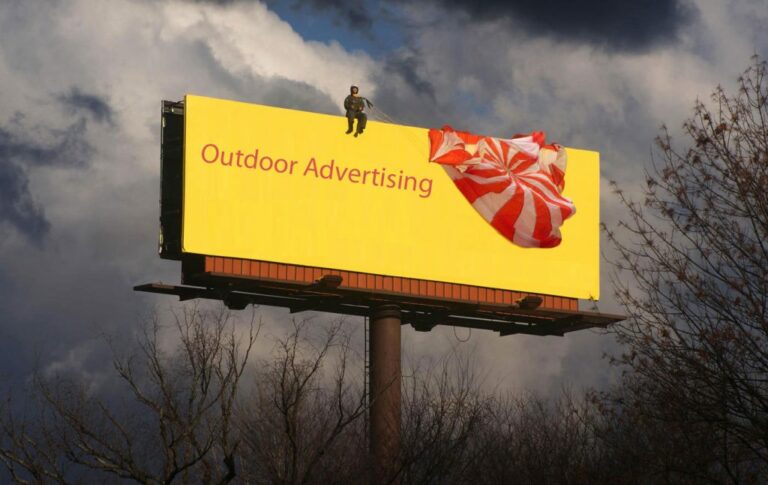
Whether it’s online or offline, shorter attention spans have taken over. While people literally skip the ads online, the fate of an outdoor billboard is not great either as the eye catches less detail by way of a speeding car.
With the attention of people being whisked away in minutes, they are no longer giving advertisers guaranteed views. So how do you cut through the mass of content? How about simplifying your efforts and dumbing down on your strategy?
With ‘Less is More’ and ‘Minimalism’ taking over every aspect of our lives, it’s time advertisers also try to capture the essence of their brand with one word, a simpler message and a moderately sized logo.
Our brains are tuned to sub-consciously recognize and appreciate simplicity. While your ads will be remembered for a long time, they also have the potential to trigger a humorous, emotional and relatable response.
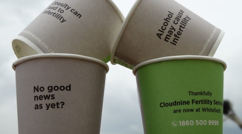
Cup Branding: A Minimalist Approach to Advertising
In the world of marketing where advertising and storytelling is everything, the fragrance of a simple, minimal idea entices people. Where they are thinking in flashes and notification updates, cup branding is right advertising that can help people choose wisely.
It breaks through the clutter with its minimalist advertising approach; it includes fewer words and images that cause less mental overload, has straightforward typography with abundant white space and exactly what you need to communicate with your target audience. Branded paper cups also tackle the shorter attention span pain point by intriguing an audience within 5 to 7 minutes.
Brands that Got the ‘less is more’ Principle Right
- Faber-Castell’s ‘true colours’ print campaign is a timeless example of minimalist advertising. The print ad cleverly fused two objects to demonstrate how their product colour matches real life inspiration.

- With literally no text in their ad, Fedex managed to move people with their ‘neighbours’ The message of sending a package to someone in any part of the world came out very naturally.

- The ‘natural finish colours’ campaign by Berger is another great example. Through the billboard, they wanted to visualise the idea that their colours match those of nature.

- Leading FMCG brand, Amul too sticks to tried-and-tested catch phrases when it comes to creating brand campaigns. In an age where other leading brands are spending nearly 8-15% on endorsements, Amul is spending only 1% of their total spends on marketing.

As a brand, it’s time to remove all the unnecessary clutter from your advertising messages, and work towards creating clarity thus giving people time to think, reflect and respond.
In a world full of visual noise, how about saying less but giving people a chance to understand more?
What are your thoughts on the minimalist craze? Would you implement a thought-proving ‘less is more’ strategy for your brand? Let us know in the comments section below.


