10 Simples Points to Consider While Designing Paper Cups for Advertising
The art of advertising has evolved into a captivating dance of creativity and engagement. Amidst this dynamic landscape, an unexpected canvas has emerged – the humble paper cup. Beyond its utilitarian purpose, the paper cup has metamorphosed into a unique and compelling medium for conveying brand messages, forging connections, and leaving lasting impressions. This article embarks on a journey through the intricacies of designing effective paper cup ads that transcend their seemingly modest stature.
1. Know Your Target Audience
Identifying your target demographic: Before designing paper cup ads, it’s essential to identify the specific group of people you want to reach. Conduct market research to gather demographic data such as age, gender, location, interests, and preferences.
Understanding their preferences, values, and interests: Go beyond demographic data and delve into understanding your audience’s interests, values, and lifestyles. This deeper understanding helps you tailor your design elements to resonate on a personal level.
Tailoring design elements to resonate with the specific audience: Once you have insights into your target audience, customise your design elements accordingly. Use colours, imagery, and messages that align with their preferences and values, creating a design that feels relatable.
2. Clarity and Simplicity
Embracing the simplicity in paper cup design: A cluttered design can overwhelm viewers, making it essential to embrace simplicity. Focus on a clear and concise design that communicates the message without confusion.
Avoiding clutter and information overload: Limit the amount of information on the paper cup. Avoid overcrowding the design with too many details, which can make it difficult for consumers to quickly grasp the message.
Crafting a clear and concise design: Your design should convey the message instantly. Use straightforward visuals and minimal text to ensure that consumers can understand the message at a glance.
3. Visual Hierarchy and Balance
Establishing a visual hierarchy: Arrange design elements based on their importance. Create a hierarchy that guides the viewer’s eye from the most crucial information to supporting details.
Placing the most important information prominently: Ensure that the key message, such as the brand name or primary offer, stands out prominently. This central placement ensures that viewers immediately grasp the central theme.
Balancing design elements: Achieve balance by distributing visual weight evenly across the design. A well-balanced composition is visually pleasing and keeps the viewer engaged without any distractions.
4. Colour Psychology
Leveraging the colour psychology: Different colours evoke various emotions and associations. Understand the psychology behind colours and choose hues that align with the emotions you want to evoke in your audience.
Choosing colours that align with the brand’s message and identity: The chosen colours should align with your brand’s identity and message. Consistency in colour usage across different branding materials creates a cohesive brand image.
Cultural undertone of colours in different regions: Colours can have different cultural meanings in various regions. Ensure that the chosen colours are culturally appropriate and resonate positively with the local audience.
5. Imagery and Iconography
Selecting imagery that resonates with the target audience: Choose images that your target audience can relate to. Whether it’s showcasing the product in use or depicting a relatable scenario, the imagery should strike a chord with viewers.
Incorporating visuals that effectively convey the brand’s message: Visuals should align with the brand’s core message and identity. The imagery should reinforce the message you want to communicate through the paper cup ad.
Using iconography and replacing text where possible: Icons and symbols can convey messages quickly, especially when space is limited. Replace lengthy text with recognizable icons to communicate concepts efficiently.
6. Typography Matters
Choosing the right fonts: Fonts play a significant role in conveying tone and personality. Select fonts that align with your brand’s character, whether it’s modern, classic, playful, or professional.
Ensuring readability and legibility in a limited space: The chosen fonts should be easily readable, even in the limited space of a paper cup. Avoid overly elaborate fonts that can hinder readability.
Maintaining consistency in typography: Consistency in typography across various designs helps establish a cohesive brand image. Use the same fonts across different marketing materials to maintain brand coherence.
7. Message and Copywriting
Crafting clear and compelling messages: Develop messages that are succinct and impactful. Clearly communicate the key value proposition or call to action using concise language.
Conveying value propositions, benefits, or calls to action concisely: Clearly convey what sets your product or service apart and how it benefits the consumer. Use concise phrases that capture the essence of your offering.
Striving for instant understandability and memorability in the message: The message should be instantly understandable and memorable. A concise and well-crafted message ensures that consumers can recall your brand and message later.
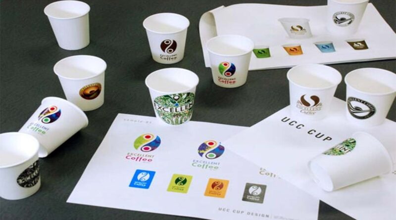
8. Branding and Logo Integration
Seamlessly integrating branding: Incorporate your brand’s visual identity seamlessly into the design. The design should feel like an extension of your brand’s personality.
Ensuring logo prominence and harmonisation: Place the logo in a prominent position within the design. Ensure that the logo’s colours and design elements harmonise with the overall aesthetic.
Maintaining consistent branding: Consistency in branding across different paper cup ads fosters recognition and familiarity. Consumers should be able to associate the design with your brand instantly.
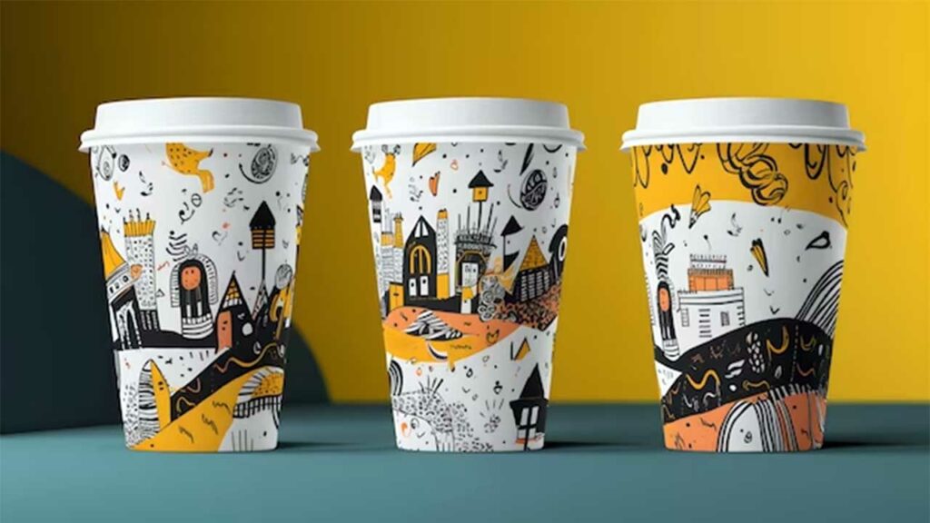
9. Adapting to the Cup’s Form
Considering the cup’s shape and curve when designing: The paper cup’s shape presents a unique canvas for design. Consider how the design will wrap around the cup’s surface and adapt your design elements accordingly.
Ensuring visual appeal from all angles: The design should remain visually appealing and understandable from all angles. Anticipate how the cup’s curvature might affect the design’s appearance.
Enhancing design elements: Adjust design elements to work harmoniously with the cup’s curvature. Enhance certain elements to ensure they maintain their impact when wrapped around the cup.
10. Incorporating Trends and Innovation
Staying Updated with Design Trends in Paper Cup Advertising
- Adapting to evolving design trends is essential in the dynamic landscape of advertising.
- Keeping up with design trends ensures that your paper cup ads remain relevant and capture consumer attention.
- Trends can encompass colour palettes, typography choices, and design styles that resonate with current preferences.
- Modernising your paper cup designs helps create a cohesive brand image that resonates with today’s consumers.
Exploring Innovative Approaches to Stand Out
- Innovation is a driving force that sets brands apart and fuels engagement.
- Paper cup advertising provides a canvas for creative exploration and experimentation.
- Consider unconventional shapes, materials, or structures for your paper cups to grab attention.
- Integrating interactive elements like QR codes, puzzles, or challenges adds a layer of engagement.
- Augmented reality experiences can turn paper cups into portals for immersive brand interactions.
- Pushing design boundaries transforms paper cups into memorable touchpoints, fostering brand loyalty.
- Innovation establishes your brand as a trendsetter, sparking curiosity and consumer interest.
- Paper cups evolve from mere disposables to powerful storytelling tools, intertwining design and technology.
Conclusion
In advertising, where seconds count and attention is a fleeting currency, the paper cup stands as a symbol of innovation and artistic prowess. The process of paper cup advertising is a delicate blend of strategy and creativity. We’ve researched the psychology of colour, the power of imagery, and the subtle eloquence of typography – each element contributing to a symphony of visual communication that leaves a lasting impression. Also revealed the strategic placement of Call to Action (CTA) prompts as guiding stars that steer consumer engagement towards desired outcomes. This seamless integration of branding elements has showcased how even a small surface can be an expansive canvas for brand recognition and identity.
With each sip, a consumer gets on a micro-journey through the design, experiencing emotions, forming perceptions, and perhaps even forging a bond with a brand they may have never encountered otherwise.