Beyond Design: Harnessing Color Psychology for Effective Paper Cup Advertising
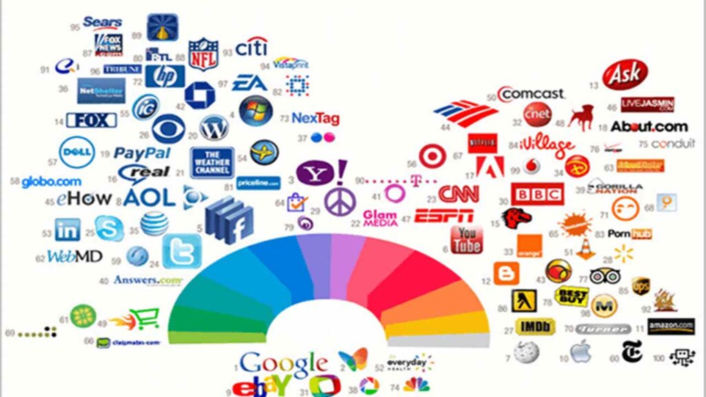
Every element counts, and one crucial aspect that often goes unnoticed is colour. When advertising your paper cup business, utilising colour psychology can be a game-changer. Choosing colours can evoke emotions, convey messages, and influence purchasing decisions. Colours have a profound impact on human emotions and behaviour.
They can influence perceptions, trigger memories, and even encourage actions. When used strategically, colours can enhance brand recognition and customer engagement, making them a powerful tool in your paper cup branding arsenal. Colour psychology in advertising is a powerful tool that can significantly influence consumers’ perceptions and decisions. This holds for various advertising mediums, including paper cup advertising.
Importance of Colour Choices in Advertising for Creating a Desired Response

Colour psychology, the study of how colours influence human behaviour and emotions, is a powerful tool when applied to advertising. Different colours evoke specific feelings and associations, making them a strategic asset in brand communication.
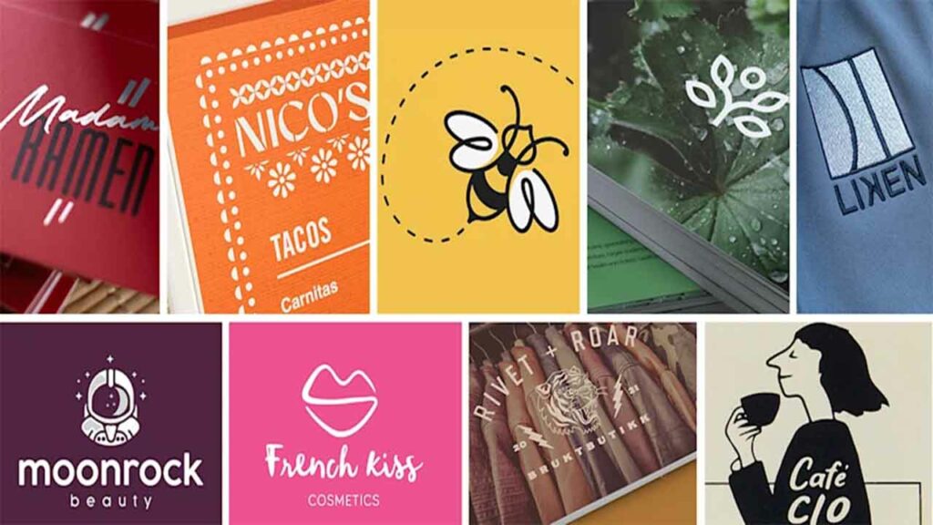
In paper cup advertising, colour choices are not just about aesthetics but can significantly impact customer perception and response. Here’s a closer look at how specific colours can be strategically employed in paper cup advertising:
Red
This vibrant colour is associated with energy, passion, and excitement. Brands in the paper cups business can use red to grab attention and create a sense of urgency. For instance, a fast-food joint could utilise red in its branding cups to convey the quick and lively nature of its service.
Green
Green symbolises freshness, health, and eco-friendliness. Brands offering organic or healthy beverages in paper coffee cups could utilise green to communicate their commitment to well-being and sustainability.
Yellow
Yellow radiates positivity, happiness, and warmth. Indian brands focusing on traditional beverages can incorporate yellow in their paper cup designs to evoke a sense of nostalgia and joy.
Blue
Often associated with trust and calmness, blue can be an excellent choice for brands that want to establish a sense of reliability. Water or beverage delivery services using paper cups could use shades of blue to inspire confidence.
Orange
Orange is a colour that combines the energy of red and the warmth of yellow. It’s perfect for brands aiming to create a friendly and approachable image. An Indian brand selling street-style snacks could use orange in their branding on cups to capture the lively spirit of Indian street food culture.
How Color Psychology Influences Paper Cup Advertising

Colours have a profound impact on human emotions and behaviours. When utilised effectively in paper cup advertising, they can communicate a brand’s message and values before a single word is read. For instance, vibrant and energetic colours can grab attention and create a sense of excitement, while muted tones can evoke feelings of calmness and reliability.
Emotional Connection
Creating an emotional connection with your audience is essential in advertising. Colors play a pivotal role in triggering specific emotions. For instance, red is associated with passion and energy, making it an ideal choice for brands aiming to convey a strong and bold message. Indian brands like Cafe Spice and ChaiWala have capitalised on red hues in their paper cup branding to evoke warmth and vibrancy, aligning with the cultural love for flavorful beverages.
Branding Consistency
Consistency is key in branding, and colours serve as a unifying element. Consistent colour schemes across all marketing materials, including paper cups, establish a visual identity that customers can recognise and associate with your brand. The popular Indian brand ChaiPoint exemplifies this by using a consistent palette of earthy tones across its paper cup designs, reinforcing its commitment to natural ingredients and sustainability.
Cultural Relevance
Understanding the cultural context is paramount, especially in a diverse country like India. Different colours hold varying meanings in different cultures. Incorporating culturally relevant colours in your paper cup designs can help your brand resonate more deeply with your audience. Brands like LassiLover have employed traditional Indian colour combinations to connect with the essence of local flavours and heritage.
Visual Hierarchy
Colours can guide the viewer’s attention and create a hierarchy of information. Using contrasting colours for important elements like logos, taglines, and product images can enhance the visual hierarchy, ensuring that key information stands out in paper cup advertising. The BrewBuddy Coffee chain, for instance, effectively employs bold typography in contrasting colours to direct attention and make their paper cups visually appealing.
Perceived Quality
The choice of colours in your paper cup branding can influence how consumers perceive the quality of your products. Earthy tones like brown and green can create a sense of naturalness and eco-friendliness, appealing to environmentally conscious consumers.
Indian brands like “GreenSip” and “EcoCup” have utilised such colour schemes to communicate their commitment to sustainability. On the other hand, deep and luxurious colours like gold or royal blue can convey a sense of premium quality, making them ideal for high-end coffee shops and speciality tea houses. “RoyalBrew” and “GoldCup Delights” are examples of Indian paper cup brands that have effectively used such colours to elevate their brand image.
Appetite Stimulation
Colours can also impact our appetites and cravings, making them a vital aspect of paper cup designs for businesses in the food and beverage industry. Warm colours like red, orange, and yellow are known to stimulate appetite and create a sense of excitement. Indian fast-food chains often use these hues in their paper cup branding to evoke the feeling of indulgence and satisfaction. Brands like “SpiceBite” and “TastyCrunch Cups” use these colours to enhance the overall dining experience.
Psychological Impact
Different colours evoke different emotions and psychological responses. For instance, blue is often associated with calmness and trust, making it suitable for paper cups used in healthcare facilities or wellness cafes. Indian brand “TranquilTea” uses serene blue tones in their branding to create a soothing environment for their customers.
Green, linked to growth and freshness, is ideal for paper cup designs in the health and fitness industry. Brands like “GreenLife Juices” leverage green shades to emphasise their beverages’ natural and rejuvenating aspects.
Stand Out on Shelves
In a competitive market, standing out is crucial. The right colour choice can give your paper coffee cups a distinct advantage. Using contrasting colours strategically can draw attention to your branding, ensuring your cups don’t blend in with the competition.
Adapting this approach, the brand Wow! Momo uses a vibrant combination of orange and white in their paper cup advertising, making their products instantly recognisable. Indian brand “ColorPop Cups” demonstrates how bold and vibrant colours can make your product instantly recognisable and appealing.
Ethical Considerations in Psychology Influences

Cultural Sensitivity and Diversity
Colour choices in branding must be culturally sensitive and respectful of the diversity that exists within India. Each colour holds distinct meanings and cultural significance across different country regions. For instance, while red is often associated with weddings and celebrations in North India, it symbolises purity and spirituality in South India.
In paper cup advertising, understanding these nuances is crucial for brands to avoid inadvertently causing offence or misunderstanding. For example, while white symbolises purity in Western cultures, it signifies mourning in many parts of India. Tailoring your colour choices to align with local cultural sensitivities ensures your message is well-received.
Transparency in Messaging
Ethical colour manipulation extends beyond just the selection of colours; it also encompasses the overall messaging. Brands must communicate truthfully, ensuring the colour choices align with the intended message. Misleading consumers through deceptive colour usage can erode trust and damage a brand’s reputation.
The colours you choose for your paper cups should authentically represent your brand’s values and offerings. Transparency in colour usage builds trust with customers, fostering a genuine connection. Avoid using colours solely for their attention-grabbing properties if they don’t resonate with your brand’s identity.
Avoiding Manipulation and Deception
The power of colour manipulation can easily be misused to manipulate consumer behaviour. Brands should avoid exploiting psychological triggers and instead build authentic connections with their audience.
Subtle persuasion is ethical, but manipulation and deception are not. While colour psychology can be a potent tool, it should never be used to manipulate or deceive consumers. Manipulative tactics can lead to negative perceptions and a loss of credibility. Strive to balance invoking emotions and maintaining honesty in your paper cup advertising.
Target Audience Well-being
The well-being of the target audience should always be a priority. Colors can impact emotions and mental states. Ethical colour manipulation involves considering the potential effects of chosen colours on the audience’s mood and psychological state. In the realm of paper cup branding, ethical colour manipulation can greatly influence consumer perception and behaviour. Striking a balance between creative marketing and responsible messaging is key to building a brand that resonates positively with its audience.
Long-Term Brand Reputation
While vibrant and eye-catching colours can attract immediate attention, brands must consider the long-term implications of colour manipulation. Indian brands that invest in paper cup branding should ensure that their colours authentically represent their products and values.
Deviating significantly from the product’s appearance can lead to consumer disappointment, eroding trust and damaging the brand’s reputation. Consistency between color-manipulated promotional materials and actual products is essential to building a strong and enduring brand image.
Final Thoughts
Effective branding is essential for standing out in the competitive paper cup business. Leveraging colour psychology can give brands a competitive edge, connecting with consumers on a deeper level.
By considering ethical implications, cultural nuances, and the well-being of the target audience, brands can create paper cup designs that not only visually appeal but also resonate emotionally. As paper cup advertising continues to evolve, understanding the art of colour psychology will remain indispensable in every marketer’s arsenal.

